Sunday, March 27, 2011

Freelance

Oh wow, its been a while guys.


I haven't had much chance to work on personal projects lately as I am currently working on 2 freelance projects. I call it freelance loosely as I would hope freelance artists get paid better or at least more frequently. Still, the projects are turning out to be very rewarding in their own ways and both are so different that it keeps me from getting too bored between the two. Both are outside of my usual line of work, but go back to some of my roots while still providing some new challenges.

There isn't a whole lot I can say about both projects. One of them, I'm under NDA with and while my client has given me permission to post stuff here, not much so far has really been postable as its all preliminary stuff right now.

This project is a 2D beat-'em-up style game intended for Xbox Live Arcade. It is the brain child of Stephen Green, a programmer who is looking to get into game design. I came into the project as sort of a friend of a friend of a friend type connection, but we've slowly been working our way towards getting his vision to light. Currently the goal is to get the game into a demo stage by early June in order to enter it into a game contest.

The main character is a Ninja character who basically fights, well. . . everyone. I'm in charge of all the art/visual parts of the game. This includes not only character design and environments, but also character animations. Animation is something I haven't really messed with in a VERY long time, but since the method of implementing the animation is similar to classic sprite sheets, I'm finding tons of references to help me along in the process.

Anyway, here's some preliminary Zombie designs (one of the many types of enemies in the game):


The other project I have going on is the art half of a board game production. My friend (and Ben's Co-worker) Ahmed Abdelmeguid needed an artist for the sci-fi board game he is working on. Having come into the project now, I've been helping him play test the game and refine the mechanics and storyline. If you like Arkham Horror and Sci-Fi, chances are you'll like this board game. It currently has no name, as we're still trying to find the perfect one for it. While the Ninja game is very cartoony and 2D, this game is getting me back into portrait painting (which I love and haven't done in a looong time). It also involves much more graphic design to it, which is something I've always avoided despite the fact that once I get into it, I tend to actually enjoy the process.

Here's one of a few possible character sheets for players to take on. I'd say this is in alpha, as all that text and numbers are just filler so that I can actually design around something.


So yeah, both games are VERY different.

I haven't forgotten about my house project, it simply has been put on the back burner for a while. I'm getting anxious to start working on something of my own again though, so I may finally be returning to it again.

I've also in my free time been reworking an old art test, trying to improve it here and there. It's been good practice although annoying since as I improve, the earlier work becomes outdated and thus the cycle begins anew, trying to get all 4 pieces up to the same level.


Still working on the stone. There's something about it that just isn't doing it for me. The stone is a pretty intensive redo of the first but still in the same theme and the wood has just been touched up here and there.


In other news we are moving to Providence in a few weeks. Still trying to find a house but its pretty inevitable that we'll be doing temporary housing for at least a month (oh god. . .living in a hotel. . . . ). Despite all that I'm looking forward to living in Providence. I haven't really enjoyed MA, as much as other places I've lived. Hopefully RI will be a better version.


Tuesday, November 30, 2010

A Few Things

I figure that since 2 holidays have passed since my previous update it may be time for another.


I've gotten through building the interior of the house and making it as modular as possible. Something a bit more challenging than I had expected in comparison to the exterior. I layed out the Uv's and everything and then proceeded to pretty much get stuck from a design standpoint.


1. Modern Homes are really boring.

Originally I had imagined this home having a more modern design but it only took a couple days of researching stuff to realize that this was going to be a very boring building aesthetically. Flat colors, everything brand new and clean. . . I was beginning to really hate it. Especially when I tried desperately to think of a way I could make it more visually interesting (on the interior) with wallpaper designs, only to realize that that would take the home from modern suburb to ultra modern demo home. I knew that lighting could always fix the problem but after staring at flat filler textures for a few days I began to seriously reconsider my approach to everything. Good thing too, as I had started to build props for the inside and at least didn't waste my time on modern appliances and instead could make some more retro pieces.

Basically I'm going a little beyond the source material here.

Pallet Town is always presented as being rather a rural town but also having a very Japanese modern feel to it. I've decided to reconsider that altogether and now am going to look at it as a much older town with slightly worn homes. Still warm and cozy but with a better sense of history. This will allow me to distort things and make certain elements a little more wonky without seeming entirely out of place. I also probably will end up redoing the town layout I had made in illustrator to look less like a suburb and more like a country village.

Realize I may need to add a fireplace now. . . .

2. Testing

Before I even got into this sort of stuff though I made sure to weld the whole piece together, create a custom collision for it and bring it into Unreal to make sure it was at least comfortable enough to run around in.

Now, characters in UDK are meant to represent a 6 ft tall person. Since I imagine this being a game of course that's bent more towards a younger protagonist (traditionally 10 or 11 but I'm going with 15/16). So I adjusted the size of the building to reflect a player character that is not 6 foot but closer maybe to 5'6".

Most everything played well. Moved through doorways pretty easily but ended up adding an extra 6 feet onto the back half of the home to give the stairs an extra bit of width for easy movement.
The family in front of their. . . home?

As you can see, I slapped on a UT texture. The skeletal meshes standing there are modified sizes. The tallest dude WOULD be 6 feet after taking the size adjustments into account with the building. The middle tallest is the actual player size (about a 5 feet and a half) and the smallest is I believe about 5 feet, closer to an 11 year old.

Next part of testing would be door movements. When building the kitchen assets, I made it so a couple cabinets and drawers can fully open to collect items out of (just for the heck of it). Rigging them up with matinee will be a bit of a pain but I'm eager to see them in action.

3. Retro Appliances have all the fun

I'm being totally serious here. They really do. Probably one of the more fascinating parts of the project (at least recently) has been getting to check out old style tv's, fridges and the like. While I would never want to have one of them as far as functionality goes, its still interesting to see the evolution of design in appliances over the years.


I may take away those room dividers since I'm starting to realize they are a bit too modern. At the very least I need to change the angles on it, maybe to be more of a paneling. Which makes me think i may need to add that to all the walls as well. . . . Anyway! Once again a couple of the drawers and cabinets there open to reveal shelves inside. The fridge also opens and has an interior. So yay for now having to dress it with all sorts of misc. items. . .


4. Color

As you can see I've been playing with flat colors so that I can at the very least not have to stare at gray all the time. These general colors will probably change though now that I'm going to do an older style home. On the second floor though are 2 bedrooms. The idea being (in the hypothetical world of this actually being a real game) 1 door is for a girl player character and the other for a boy. Whichever bedroom is the opposite of the player character's gender would be locked. Both rooms will have (not an over the top) design slant towards one gender or the other. Pokemon has actually used this kind of switch before in their games.

As for the exterior, I'm playing with a red/blue combo, somewhat similar to traditional pallet town colors.


It'll be roughed up more of course. Still haven't decided how red I want to go with the tiles. I don't want it to be boring looking, I want it to look distinct enough. I really want another accent color for the window frames but more blue just looks too God Bless America and any other color looks less sincere. So it'll probably stay white.


Okay I'm starting to bore myself.

I'll leave with this finalist for the National Geographic Photo of the Year contest. There are other photos in the "places" category that are more than likely (and deserving) to win, but this one really caught my attention for some reason. I think it's mostly to do with the colors and shadows. Yeah, yeah, I know, its probably tinkered in photoshop, but still inspiring.


You can see the other entries here. Be careful, as I spent 2 hours today just looking through all of them.

On the Games Front:
I've been playing Rome: Total War (an oldie at this point, and boy does it show graphically. . .). It's been a while since I've played a really good RTS. I have like 2 on my xbox right now that I'll probably never get around to playing, mostly cause an RTS on the xbox is exactly what it sounds like: dumb. I have 2 because one was given to me for free. Anyhow, I've been sitting on Rome for almost a year now thanks to all the Steam sales that seduce me into buying games that I normally probably wouldn't consider or even get around to playing right away. I have to say I like it a lot. The battle AI can be really frustratingly stupid at times and requires a good deal of micromanaging. The overall campaign and governing side of things though is pretty detailed and kinda awesome, especially when you start hoarding more money than all the other factions combined.

I started a few different campaigns and learned from mistakes in them before finally hitting it up hard with the Brutii Roman faction. Currently I have over 50 regions (part of the requirements to beat the imperial campaign). Now I have to take over Rome and the senate, but that seems almost impossible right now considering that the poor Scipii Romans have been pretty much landlocked to Eastern Africa during the entire campaign so they have like 20 armies just twiddling their thumbs back near their capital which happens to be right next to Rome. So basically the minute I set up siege on Rome those guys are gonna throw a shit and start wailing on me with all they got. I'm almost willing to just call it, considering I own 60% of the map (pretty much the entire western side of it) And the only other factionthan the roman allies are the Britains.

I also got the expansion as part of the bundle and I tinkered with it a bit but I'm not all that impressed. Its pretty much the exact same thing just many more smaller factions. I may give it a better go later on.


I've also finally been getting into Team Fortress 2. I'm waaaaay late to the party but never had people to play with (not to mention the time) until now. Ben plays it a lot so I've started joining in. Now that I've been playing it somewhat regularly I'm starting to like it now that I've gotten a hang of things. FPS's have never been my strong point, mostly cause I can't bring myself to suffer through that initial embarrassment of working my way over that learning curve while playing with other people.

Ben also bought me Left 4 Dead 2 recently when it was on sale and we've been playing some of that with friends. Add to that our recent love for the new Walking Dead show on AMC and I'm starting to have a lot of zombie on the brain. If that show has taught me one thing, its that my suspicions have always been correct that red necks will be the most likely survivors in a zombie apocalypse. Makes me think that maybe I should learn to shoot a gun, just in case. . .


The man has a crossbow and no sense of right and wrong to hold him back! He's gonna out survive you!

Tuesday, October 19, 2010

Craft

So I have this crippling fear that I'm going to lose access to this blog because it is attached to my old school e-mail which in essence doesn't exist anymore, and any attempts I've made to try and change it to something else for some reason aren't working. I just hope it never asks me for a confirmation or something cause I'd be screwed.

Anyhow. . . Hi folks.

So during my exile to the land of apartment girlfriends, I've been keeping busy with sort of a split personality of interests and hobbies. I also had an art test a few weeks ago so we'll see how that plays out. But as usual when I am left to my own devices I have turned back to good ole crafting to keep me sane during my endless amounts of free time. I love making digital things and so forth, but I also yearn back to my old foundation classes in college when we worked with sculpey and paper and hot glue that I always managed to burn myself with. I miss the tactile feeling of being able to touch and hold what I've created, you certainly don't get that with digital works. Normally I tend to turn to sewing when I get these urges but sadly I have no sewing machine currently.


So for a little over a month now I've been dabbling in the geekdom that is Papercraft. If you don't know, papercraft is basically making 3D models out of paper. Its kinda like origami except with glue and multiple pieces. It fascinates me cause most of the time it works much like 3D computer models do. You design the model, cut it up into pieces that can be layed out flat and printed out, then you glue those pieces together. Its much like UV unwrapping and texturing but without the undo button. I have found that it fulfills both my interests of creating something on a computer but being able to still hold it in the real world. I had heard of the craft before but recently stumbled across a site that designs and creates Pokemon papercraft models. They have done some pretty amazing models and it has been my introduction into the whole process. It was frustrating at first, I went through about 3 failed models before I successfully completed one (mostly by choosing less complex models to practice with). Its fun to put it all together, but the cutting out all the pieces is the most annoying part. However I have gotten pretty good at using an exacto knife now.

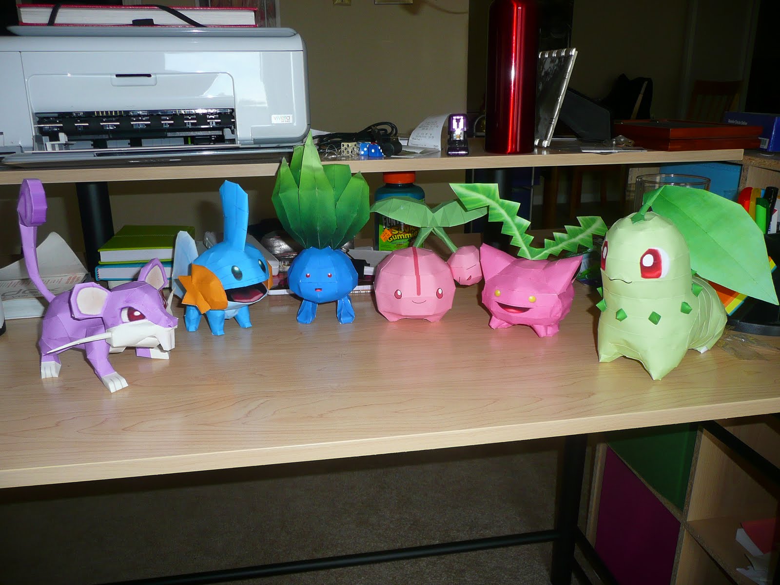
So here's the ones I have so far:


As you can see, lots of grass pokemon, cause they are not as complex and good for beginners. I also have a Charmander I made last week, but he wasn't done when this picture was taken. Ultimately I look foward to designing a model myself, potentially maybe off of one of Ben's character models, or hell, maybe an environment (though I find they are far less popular).

You can find these models and many many more like them at PaperPokes
And for the truly ambitious, how about a life size Link? Also, that guy is my new hero.

Also fairly recently, I decided to finally try my hands at book binding, something I had always said I would do but never did. I believe I even joined SCAD's club for bookbinding but then never attended a workshop. But the good news is, that it isn't too hard, and not even all that materials heavy. I tried a couple small books using a Japanese method, but then decided to try a Coptic Binding (where the spine is exposed but you can see all the pages sewn together) and the Secret Belgian method (which does have a covered spine).
(Its also awesome cause it means I get to work with fabric again! :D )


But on to more relevant things for this blog. I know I should be working on grander designs and epic environments but I also like seeing things be finished before I get too busy to ever work on them again. As you could probably already guess, I've become newly infatuated with Pokemon (but this happens like once a year, so not exactly huge news here). But while bored and perusing Deviant Art not too long ago, I saw that some 3D artists were starting to adapt Pokemon buildings and props (i.e. pokeballs) into wonderful 3D renders. It got my imagination rolling and I realized that I really wanted to adapt something also.

There are alot of different places in Pokemon (I mean, we are now up to 5 continents) but one of the more iconic ones I could think of was the Player's home. Its where you start off at the beginning of the game and is in most versions your beginning visual composition. The problem is that there isn't exactly anything super iconic about the house ( for clarities sake I'm just going to refer to Pallet Town's from Gen 1 and Fire Red and Leaf Green). First off, its just a tiny cluster of pixels, you never exactly get a sense of style off of it or even much information about its structer and secondly. . well . . its a house. Its not a tree house or a fantasy hut or anything its just a house. So it wouldn't exactly be the most interesting model I would make.

In the world of Pokemon, 3 buildings makes a town.

Style wise, all you can really tell is that its a pretty typical 20th century home, relatively modern,with white siding. So I started looking at contemporary suburban home designs and got a few elements I liked. Things that could easily be relatively easily modularized into pieces that could be used again for slightly different buildings in the same town, while still looking like more than just a box with windows and doors. But the idea here is that I wanted to approach the model as if Pokemon was made into a 3D RPG or MMO (which would be the most amazing thing to happen. . . like ever!). So I want the structure to be functional (something I never got to see to fruition with the original Emerson). So I thought out the floor plan (In the game sit was just the living room and your bedroom, but hey, lets give it a bit more thought) and how the player may be able to move around and explore a little more, maybe make the home a little more than just the place you want to get out of as soon as possible.


I did an elevation drawing by hand because I thought it would be fun, but then realized architects have T-squares for this sort of stuff (it was still kind of fun though). As well as Interior layout of the rooms and so forth, trying to compensate for modularity and so forth.

Finally I went into Maya and firstly fleshed out a non modular building so that i could get a 3D idea of where things were in relationship to others. I then went into Illustrator and began to cut up my overhead layout into logical modular pieces (which would of course influence the 3D version too). I then built the modular pieces using my original 3D model as reference. So right now, the exterior pieces are made and Uv'd. On the original 3D model I had made some gutter pieces but right now they are not included in the final model as I'm not sure if they really add a whole lot to it. I may end up changing my mind if I can find a way to squeeze them into the current texture space.

So yeah, here's an occlusion.


Yeah, that siding is modeled. Originally I wasn't going to physically model it in there but then Ben had to open his mouth about next gen graphics and blah blah . . .DAMMIT HE'S RIGHT! So I did it. It does look pretty awesome and it didn't actually increase the poly count to the point where it might crash UDK or something (there is less than 5K right there). I'm also considering adding in some stray roof tiles just to add a hint of dimension. I don't want to go crazy with the roof though, considering you'll never really see it when playing.

I could go much further into the logistics of the interior layout and why I did what, but this post is already too long and I'm sure I'll make a post about the interior at some point so. . . let's just leave it till then.

Tuesday, August 31, 2010

Oh hai!

Hey Everybody!


Long time no see. This past month has been a very very hectic one as, (surprise!) I can no longer say my home address is Indianapolis, but instead is Marlborough, MA. Yeah, that's right. I moved out for better or for worse. Some of you may know that Ben recently got hired at the wonderful 38 studios here in Maynard and I, like every girlfriend since antiquity, came along with him.

So after the weeks of planning the move, making the move, making sure we weren't sleeping on the streets the first few nights, got an apartment, furnished it and then realized we are pretty much broke all over again. . . I can say that we are finally settled! Massachusetts so far is a pretty cool place. We visited Boston our first weekend after the move in and all I gotta say is "meh" but then again when you barely have enough money for parking let alone seeing any sites, its kinda understandable why our experience was a little lack luster. (We walked the freedom trail but didn't have the cash to go into places like Paul Revere's house. So it basically turned into a tour of graveyards).

So what have I been doing while Ben is at work (like all freakin' day)? I've been home, alone, working on a new portfolio piece which I will now share with you. I've been very eager to get it done and since its creation took place around the move, its been difficult to update on it. So I'm gonna try my hardest to give you guys a breakdown of how it all came together.

I wanted to try my hand at something that is 100% hand painted but still with a good amount of detail. Basically the types of stylized assets that I always wished I could make but never had the time or resources to pull it off. Its been slow going (as you'll see) because after 2 years of doing photo based textures and modeling in 3D, my painting skills have fallen by the wayside. It took a bit of patience to get back into the swing of things.

I decided to make a relatively large asset that still was somewhat intricate but without requiring me to devote weeks to creating a full on scene. I think that's my biggest pet peeve about my portfolio is that somehow I always end up doing complete scenes when sometimes, I wish I just had a collection of really bad ass individual objects. Anyway, a gypsy wagon ended up popping into my brain one night and voila! A new project was born.


The modeling was actually the easiest part of this piece, which is somewhat surprising when i think back on how complicated it seemed to me at first. Mostly cause there is no good reference out there for what the heck is going on in the undercarriage of a wagon like this. In the end I had to pretty much settle for whatever I could make out in just your average pictures and realize that in a game environment unless an angry mob knocked the wagon over (which with Gypsy's is always a possibility) you weren't going to really see the undercarriage much. I think I got it pretty close though, minus maybe a few thingamajigs . . .

Next came the painting, or rather first, the planning out of the painting. Gypsy wagon's are supposed to be very colorful and artistic, but I already knew I wanted mine to look a little more run down. I actually considered switching gears and making it more of an old salesman's wagon (like the guy at the beginning of the Wizard of Oz) but in the end I pretty much stuck with the original plan and now color became a big question mark.


So this is the original color scheme (some things changed) as well as the original layout (which also changed to maximize size on certain things.) As far as color goes, it pretty much stayed the same, though in the end I chose to have more bare wood showing in places as opposed to having the entire thing be covered in peeling paint.

I then decided to approach the individual textures, well. . . individually, in their own files. This way I could easily place it out on the actual texture map and be able to deform pieces as I liked. So the wood came first of course and the wood went through about 4 different stages before settling on the final one. Part of this was me warming up my painting skills, and the other part was me pushing the level of detail. So here's a quick montage of the evolution of . . wood.


There were quite a few sub variations of many of these but sadly I don't have the iterations saved.

A few more textures that went into the making of the wagon. . .


And yeah.

I ended up going back into the mesh and sagging it up a bit in places (making it look like it may not be up to safety code) and adding more mesh detail in certain places. I ended up completing modeling out the curtains where as originally they were pretty much a scrunched plane. But after deciding on the draping fabric as opposed to just a typical hanging curtain, I realized that the mesh should reflect some of that form.


And so with some final lighting and the entire compiled Texture Map. . .


A couple things I wish I could change (but its a bit late in the process now). I wish I could have once again reallocated space for the UV's. Over the process of painting the thing, my ideas towards certain parts of the mesh changed along with their general importance. For example, the drapes should really have more space, but I didn't realize this till after I changed my entire approach to them and by that time there was no real extra room to give them or move them to. I wish I had decided on that back from the beginning or around the second time I reorganized the Uv's.

Same thing goes for the windows. I ended up enhancing their size by the end of the build which stretched their pixels a bit to the limit.

So . . . yeah. . .

Whats next? Well you may remember that Windmill I started a while back. I'm not sure where to go with it. Part of me wants to stick with doing hand painted stylized stuff, since quite frankly it was a lot more fun than I had expected (its wonderful how much more enjoyable these things can be without a school deadline). However I had never really intended for my rework of Emerson to go in that direction, I had always imagined it being photo real, Call of Duty kind of stuff. So I'm torn now whether to do something completely different, or just do Emerson in a different style. Hmm decisions.

Anyhow, I'm taking the day off now, as this wagon has stolen way too much of my attention this past week. It is now up on the website though. http://www.denisetomlin.net/Wagon.html

Hope everyone out there is having a good summer! I keep hearing about people getting hired finally (people who I thought should have been hired the first day out of school). So congrats to all you guys! I miss your talent being near me! (lol, that sounds stupid. . . )


Friday, July 2, 2010

Long time no Write

Yeah its been a while, I apologize.

I've decided to keep with Emerson as a project but I'm gonna revamp it. I.E. start all over from concept up. I'm thinking of ditching melding it all into a single house and trying for a more complex and rounded scene, i.e. a village layout. So basically Emerson is gonna get cut up and redistributed. Also the setting is gonna change slightly. Rather than being English specific I'm gonna broaden the context a bit and think more along the lines of farm settlements. Basically its gonna be more of a fusion of new world and old world stuff.

To get back into the swing of things, I started working on a windmill a couple weeks ago, after buying a new reference book of farmsteads. I THOUGHT it would be a relatively simple construct to warm up with. What I didn't realize is A. that American style windmills are more complex than you think and B. Dragon Age: Origins is a really addictive game.

Based on the research I've been doing on these kind of structures the mechanics in the upper part, that help pivot the wheel and so forth are pretty intricate especially in more modern models. I decided to dumb it down a lot for the sake of polys and can hopefully make it look believable with texturing as opposed to modeling every gear and socket. Not to mention its way up top, where you will rarely see it. All in all, its Just over 2000 tris, which is a lot better than I thought it was going to be initially. It's been unwrapped and now needs to be textured. I'm thinking of trying something interesting with this project in that I'll be doing my usual photo real type textures but I also want to play around some more with hand painted stylized. I really like the details in Dragon Age which is sort of border line between trying to be highly detailed realistic and more simplified and painterly.

So basically. . . double the texturing for objects, at least for a few, just as kind of an experiment. I'm starting to think that probably wont' show very well on such a thin structure but we shall see. I'm mostly excited to get back into photo real stuff though, after doing Rifts slightly stylized stuff and then redoing Bonabba in a hand painted style. I really should go out and take some textures around town in my free time.

Anywho . . how bout some occlusion passes, since everyone loves those! I also want to finally zbrush that well I had started last winter since I still want to use it.


Tuesday, December 1, 2009

The Campaign Marches On

You may notice a new title to the site. Although ITGM 405 is over for me, the project is not. I plan on continuing my updates on my progress here on this blog. Will not be as frequent perhaps but will still happen.

After almost 2 weeks of resting up and having some fun, I decided to actually get some work done today. I worked on a well that I've decided to put in the back of the yard. Will also be working on vegetation soon. In the picture below you'll also see a broken carriage wheel that I plan on leaning up against the carriage house. All have been UV'd, plan on bringing the wheel into zBrush soon and doing some stone sculpting.

Thursday, November 19, 2009

Post #37

Good Job everyone on your projects!


A basic poster I made as a final tweak (it's big, may load slow)